
I04
I04
I04
Users don't recover from errors because they see an error message, recovering because they understand the system.
Users don't recover from errors because they see an error message, recovering because they understand the system.
Users don't recover from errors because they see an error message, recovering because they understand the system.
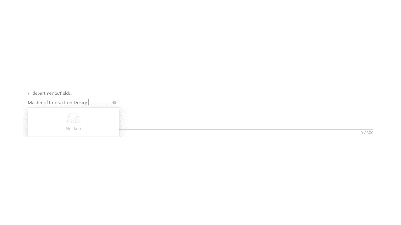
While completing a job application, I spent nearly thirty minutes trying to resolve a simple formatting issue and a "No data" dropdown error. The interface repeatedly rejected my input, yet never explained why. I wasn't fixing my mistake, but trying to guess the system's rules.
That experience changed how I think about error messages.
An effective error message is not simply an alert. It is a communication layer between human expectations and system logic. When users understand what happened, why it happened, and what they can do next, they can recover quickly and continue toward their goal instead of repeatedly testing different inputs.
Looking back, the issues all pointed to the same underlying problem:
System rules were invisible until an error occurred.
User expectations did not match the system's internal logic.
Recovery depended on trial and error instead of clear guidance.
These observations align closely with usability principles such as visibility, feedback, and error recovery, but they also reinforced a broader lesson for me:
Good systems do not simply detect errors, they make their own rules understandable before errors happen.
Whether designing enterprise workflows, AI systems, or application platforms, reducing interpretation effort is often more valuable than improving error handling alone.
Bad Examples:
Expected journey: Applicants should be able to entry data smoothly without unnecessary page jumps or unclear requirements.
Mental model mismatch
What: typing experience did not match company's defined dataset result in "no data"
How to improve:
expanded categories matching rules
display dataset expectations before typing
Unclear system rules
What: no input format guidance was provided, only discover after submit without reasons
How to improve:
provide format instruction before actions
High time cost
What: applicants was force to test until system accept
How to improve:
explain the expected result or input rule
Good Examples:
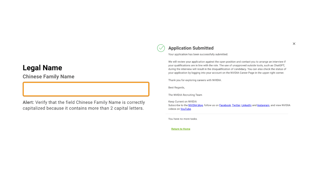
Specific error explanations with examples
Clear actions for what users need to do next
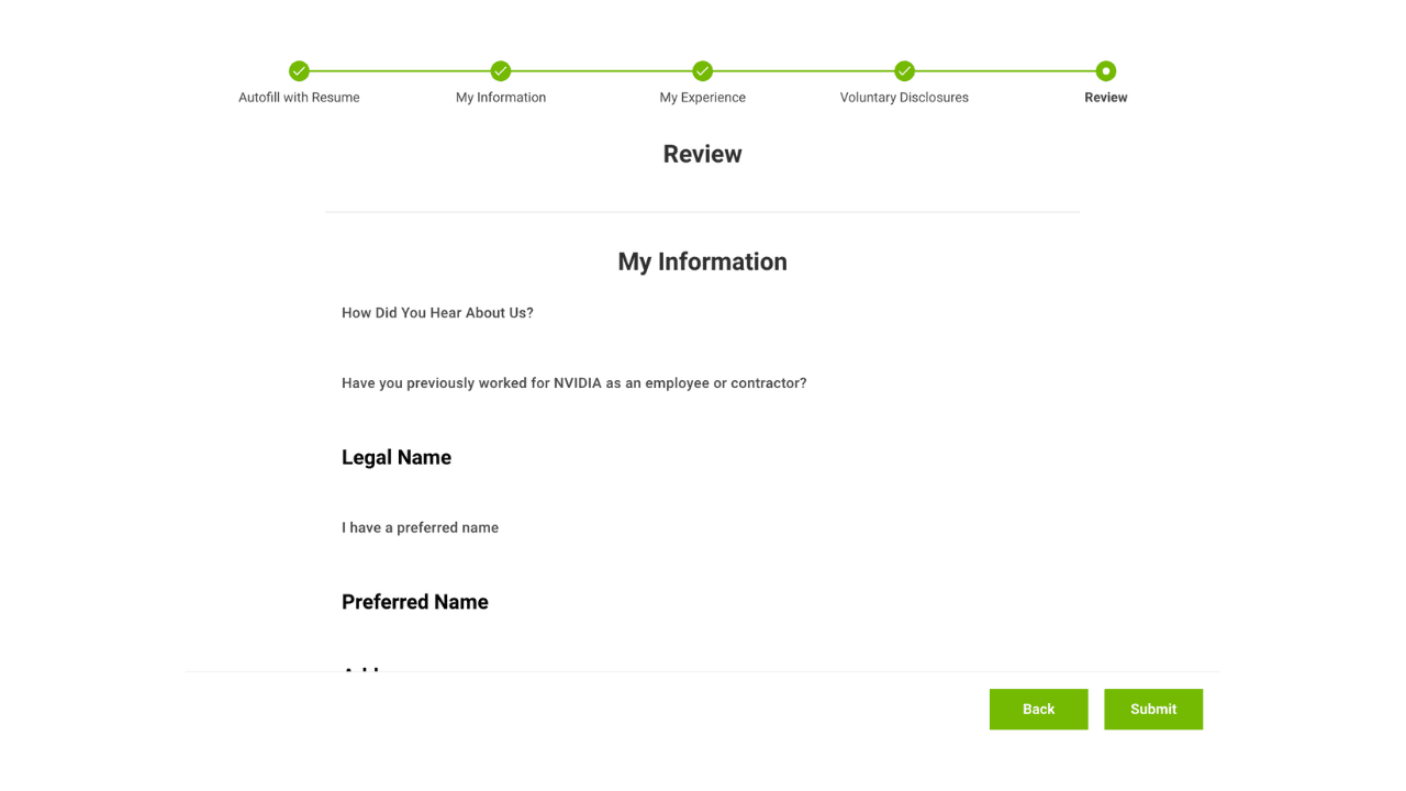
Transparent system flow
While completing a job application, I spent nearly thirty minutes trying to resolve a simple formatting issue and a "No data" dropdown error. The interface repeatedly rejected my input, yet never explained why. I wasn't fixing my mistake, but trying to guess the system's rules.
That experience changed how I think about error messages.
An effective error message is not simply an alert. It is a communication layer between human expectations and system logic. When users understand what happened, why it happened, and what they can do next, they can recover quickly and continue toward their goal instead of repeatedly testing different inputs.
Looking back, the issues all pointed to the same underlying problem:
System rules were invisible until an error occurred.
User expectations did not match the system's internal logic.
Recovery depended on trial and error instead of clear guidance.
These observations align closely with usability principles such as visibility, feedback, and error recovery, but they also reinforced a broader lesson for me:
Good systems do not simply detect errors, they make their own rules understandable before errors happen.
Whether designing enterprise workflows, AI systems, or application platforms, reducing interpretation effort is often more valuable than improving error handling alone.
Bad Examples:
Expected journey: Applicants should be able to entry data smoothly without unnecessary page jumps or unclear requirements.
Mental model mismatch
What: typing experience did not match company's defined dataset result in "no data"
How to improve:
expanded categories matching rules
display dataset expectations before typing
Unclear system rules
What: no input format guidance was provided, only discover after submit without reasons
How to improve:
provide format instruction before actions
High time cost
What: applicants was force to test until system accept
How to improve:
explain the expected result or input rule
Good Examples:
Specific error explanations with examples
Clear actions for what users need to do next
Transparent system flow
While completing a job application, I spent nearly thirty minutes trying to resolve a simple formatting issue and a "No data" dropdown error. The interface repeatedly rejected my input, yet never explained why. I wasn't fixing my mistake, but trying to guess the system's rules.
That experience changed how I think about error messages.
An effective error message is not simply an alert. It is a communication layer between human expectations and system logic. When users understand what happened, why it happened, and what they can do next, they can recover quickly and continue toward their goal instead of repeatedly testing different inputs.
Looking back, the issues all pointed to the same underlying problem:
System rules were invisible until an error occurred.
User expectations did not match the system's internal logic.
Recovery depended on trial and error instead of clear guidance.
These observations align closely with usability principles such as visibility, feedback, and error recovery, but they also reinforced a broader lesson for me:
Good systems do not simply detect errors, they make their own rules understandable before errors happen.
Whether designing enterprise workflows, AI systems, or application platforms, reducing interpretation effort is often more valuable than improving error handling alone.
Bad Examples:
Expected journey: Applicants should be able to entry data smoothly without unnecessary page jumps or unclear requirements.
Mental model mismatch
What: typing experience did not match company's defined dataset result in "no data"
How to improve:
expanded categories matching rules
display dataset expectations before typing
Unclear system rules
What: no input format guidance was provided, only discover after submit without reasons
How to improve:
provide format instruction before actions
High time cost
What: applicants was force to test until system accept
How to improve:
explain the expected result or input rule
Good Examples:
Specific error explanations with examples
Clear actions for what users need to do next
Transparent system flow