F02
F02
F02
Visual consistency becomes difficult when interfaces scale across different content and layouts.
Visual consistency becomes difficult when interfaces scale across different content and layouts.
Visual consistency becomes difficult when interfaces scale across different content and layouts.
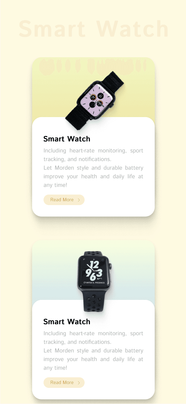
Rather than treating cards as isolated UI components, I explored how layout, visual hierarchy, and reusable design patterns could work together as a scalable interface system. By establishing consistent spacing, color relationships, elevation, and reusable Auto Layout structures, the design improved information clarity while maintaining visual consistency across different content types.
Design Principles:
Information hierarchy through spacing
Whitespace defines relationships between content and improves scanning efficiency rather than simply adding visual balance.
Color as an organizational system
A consistent color palette creates visual coherence while helping users distinguish content priority and interface states.
Elevation communicates interaction
Shadows provide visual depth that naturally indicates hierarchy and encourages exploration.
Reusable layout structure
Auto Layout enables scalable and consistent UI components that adapt efficiently to different content.
Reference
A practice project inspired by “100 Ways to Design with Figma” (UI/UX course by Riven).
Rather than treating cards as isolated UI components, I explored how layout, visual hierarchy, and reusable design patterns could work together as a scalable interface system. By establishing consistent spacing, color relationships, elevation, and reusable Auto Layout structures, the design improved information clarity while maintaining visual consistency across different content types.
Design Principles:
Information hierarchy through spacing
Whitespace defines relationships between content and improves scanning efficiency rather than simply adding visual balance.
Color as an organizational system
A consistent color palette creates visual coherence while helping users distinguish content priority and interface states.
Elevation communicates interaction
Shadows provide visual depth that naturally indicates hierarchy and encourages exploration.
Reusable layout structure
Auto Layout enables scalable and consistent UI components that adapt efficiently to different content.
Reference
A practice project inspired by “100 Ways to Design with Figma” (UI/UX course by Riven).
Rather than treating cards as isolated UI components, I explored how layout, visual hierarchy, and reusable design patterns could work together as a scalable interface system. By establishing consistent spacing, color relationships, elevation, and reusable Auto Layout structures, the design improved information clarity while maintaining visual consistency across different content types.
Design Principles:
Information hierarchy through spacing
Whitespace defines relationships between content and improves scanning efficiency rather than simply adding visual balance.
Color as an organizational system
A consistent color palette creates visual coherence while helping users distinguish content priority and interface states.
Elevation communicates interaction
Shadows provide visual depth that naturally indicates hierarchy and encourages exploration.
Reusable layout structure
Auto Layout enables scalable and consistent UI components that adapt efficiently to different content.
Reference
A practice project inspired by “100 Ways to Design with Figma” (UI/UX course by Riven).